A Guide to Restaurant Colors and Why They're Essential to Design
Elizabeth CoulsonAuthor
You probably wouldn’t believe me if I said that restaurants are built and designed to cater for the taste buds of the mass. That’s because it’s a lie.
In truth, restaurants are actually crafted in a way that subtly lures individuals through the doors, to the table, and to the food.
Although subtle, the techniques used are highly effective (such as the tricks behind menu designs) and more strategic than you may initially think, and a restaurant's colors are rapidly becoming the holy grail of restaurant design. Color schemes often vary from place to place, all depending on the message you want to promote and the types of eaters you want to attract.
Other ideas are introduced depending on the space you’re working with. Light restaurant color schemes are often used in smaller establishments to make them appear larger, and darker tones for the opposite effect. After all, there's nothing worse than a restaurant looking empty!
Pending on the location, cuisine, or branding, colors appear to create a unique identity for any given restaurant or fast food chain. But once you look a little deeper into the colors that are being favored over others, the psychology behind the designs begin to unravel and make total sense.
Restaurant Floor Plan Templates
Use these restaurant floor plan templates to get inspired as you map, or reimagine, the layout and space setup for your restaurant.

1) Light, Aztec, and Dark Blues
The color blue is one of tranquility, peace, and honesty. When you think blue you’re likely to imagine a beautiful clear sky or relaxing waters drifting on by, and it’s for these reasons that restaurant designers feel inclined to include a vast array of blues in their designs.
From a design perspective, blue may not compliment most foods, but can be visually appealing when mixed in moderation with warmer colors and complimented by the use of light toned woods and table tops.
Some color experts have completely eliminated blue as an effective color for restaurants as they believe we associate it with thirst rather than hunger, but others believe that this is simply not true.
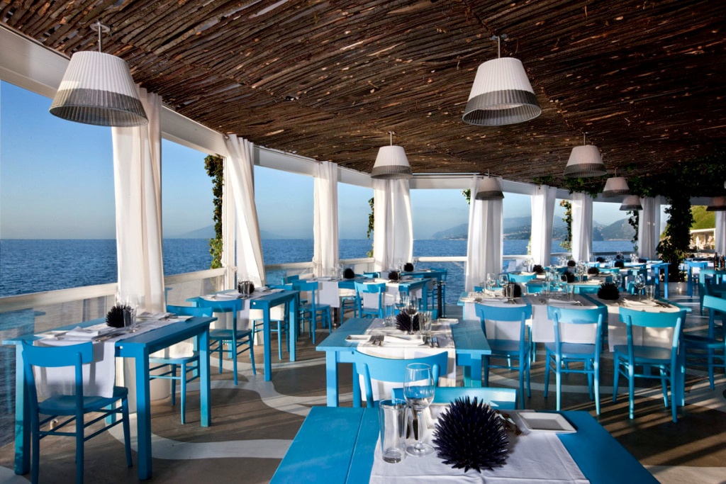
Capitalizing on its luxurious shoreline location, Il Riccio in Italy captures this oceanside concept perfectly with it blue coloring.
2) Brown + Others
Brown is often associated as a restaurant color that is down-to-earth whilst portraying a significant amount of stability, support, and a strong dose of security – which in turn creates a sense of belonging.
This is a color that restaurant designers have often shied away from, due to its reputation as a “food suppressant,” but when used in the right ways, it can actually have hugely positive effects on getting the right customers through the door and turning them into loyal ones.
For example, restaurants that are the target of healthy eaters often use light shades of brown along with greens and purples. This way the palettes blend comfortably together whilst we naturally associate the likes of green and purple with healthy foods above all. The Prasino, a Chicago-based Greek restaurant, offers perfect examples of this.
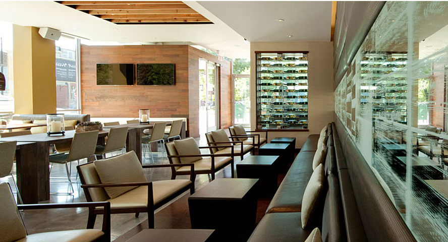
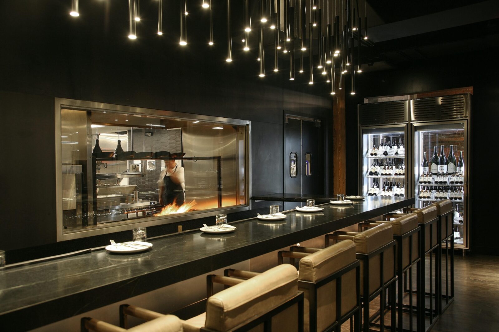
From a more general perspective, many restaurants are sticking to more traditional methods of design by combining plain white and gray layers with elegant, rustic woods with lighting being the focal point of attention. Wringer & Mangle illustrates this technique.
Restaurant Marketing Plan
Create a marketing plan that'll drive repeat business with this customizable marketing playbook template and interactive calendar.

3) Pumpkin/Squash Orange
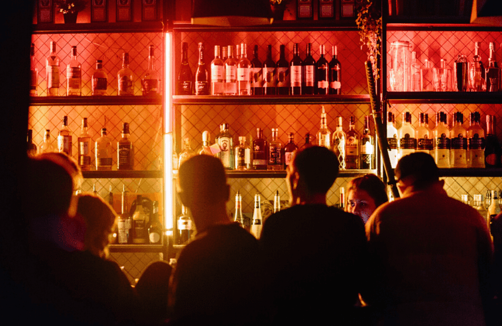
Orange is described as the color of adventure and social communication that positively portrays traits including optimism, enthusiasm, and self-confidence - what could be better for a vibrant dining environment?
Specific shades of orange are gradually being included in more and more dining designs where suitable. Orange and yellow tones naturally make diners develop a stronger sense of physical attachment to live and promote more cheerful responses to any given space, which is exactly the kind of reaction any eating establishment would thrive upon.
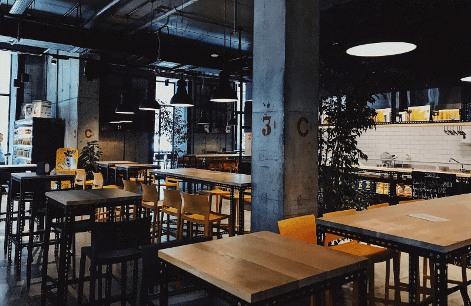
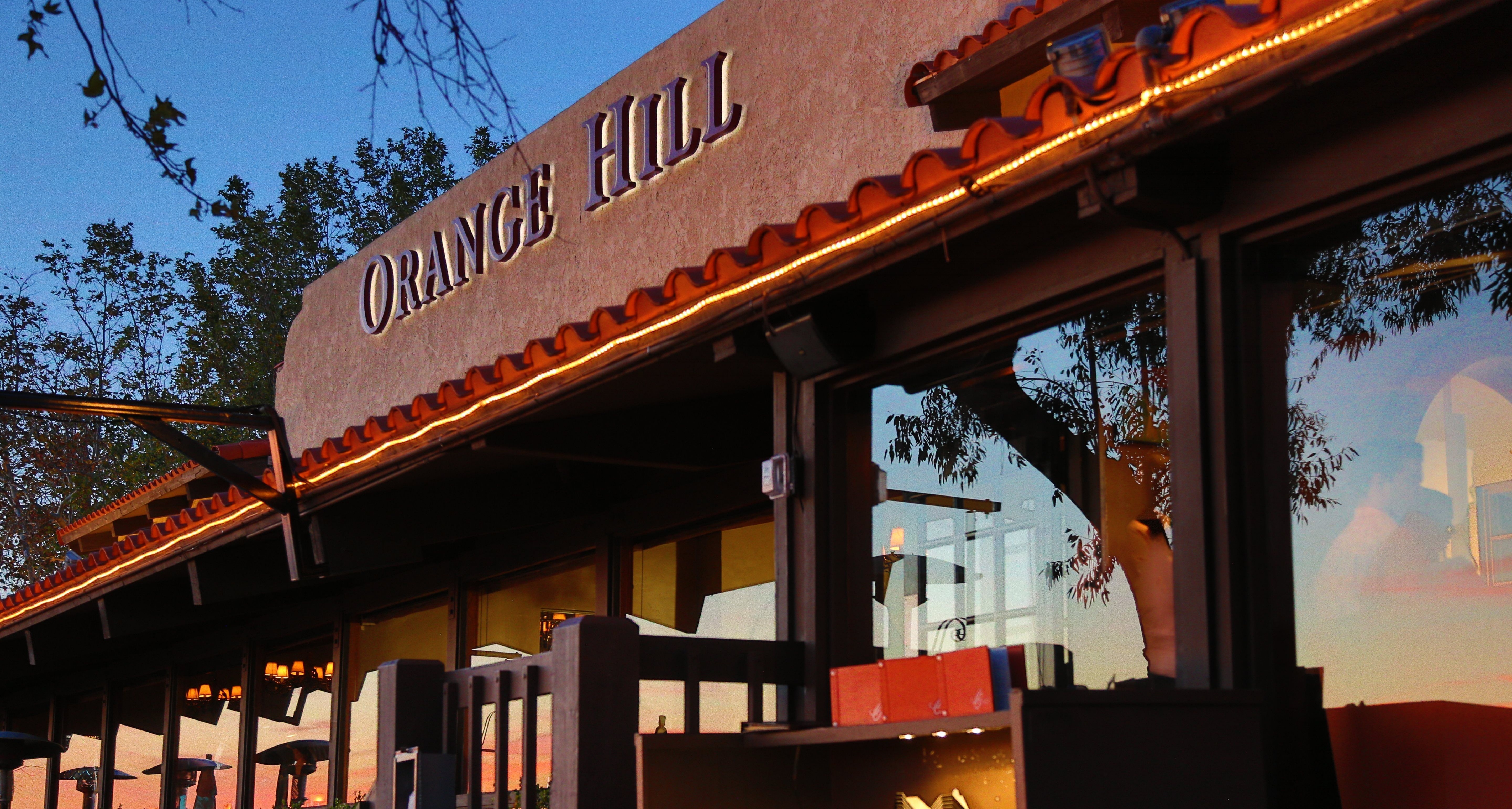
For example, The Orange Hill Restaurant mixes subtle pieces of orange furniture with trusty black and brown tones to develop a sense of excitement whilst also depicting a trustworthy and elegant dining experience.
Thanks to its versatility, many shades of green also goes great with these orange and yellow tones, which explains why it is widely used in restaurants who are promoting vegetarian and vegan cuisine as this textural mix present an overall fresh, healthy, and active environment.
4) Tranquil Turquoise
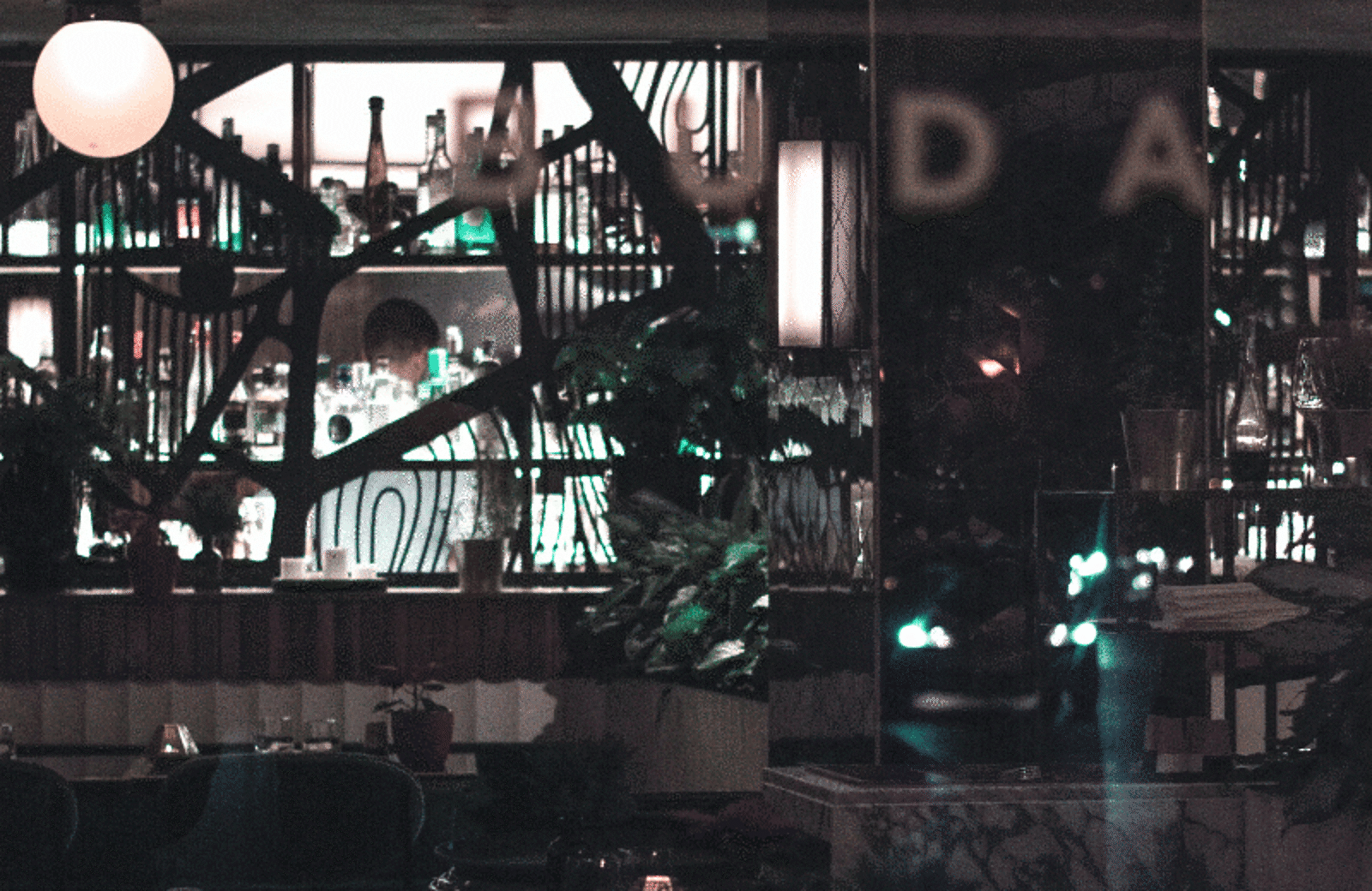
Turquoise shares many of the same properties as the color blue in that it enlightens the mind with a sense of happiness, positivity, and creativity, which has made it the go-to palette for restaurants and cafes who desire customers from a more artistic and collaborative walk of life.
This also makes it the perfect hue to be used in minimal fashion which blends nicely within a DIY setting – think high ceilings, vintage copper lighting, exposed industrial walls, and rusty metal features.
Above all, it is a color that is known to empower individuals by creating emotional balance and stability, which makes it perfect for the restaurant owner who aims to embrace a community feel - which is hard to resist for any establishment.
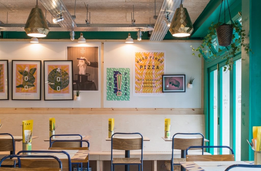
Four Hundred Rabbits in London are the perfect example of this sort of colour use; it’s easy to see why they were shortlisted for the Restaurant and Bar Design awards in 2016.
5) Just Gray
That’s right. One colour which is known to repel us from the thought of wanting to eat is very much part of the restaurant color trend. Saving the best until last?
Many designers are embracing fresh, contemporary grey tones as it allows for creativity and bolder blotches of colour in other areas of the design. This results in a more eccentric use of furniture, accessories, and materials including solid wood, brass, and marble.
Fine dining and more upmarket restaurants are embracing the possibilities that a predominantly grey palette offers, thanks to its minimalistic traits. Casa Cavia in Argentina has made this work beautifully.
Grey tones also represent a sense of composure and calm thinking, which would make it the perfect place to break-up over dinner, perhaps?
Related Restaurant Design Resources
Is this article helpful?
DISCLAIMER: This information is provided for general informational purposes only, and publication does not constitute an endorsement. Toast does not warrant the accuracy or completeness of any information, text, graphics, links, or other items contained within this content. Toast does not guarantee you will achieve any specific results if you follow any advice herein. It may be advisable for you to consult with a professional such as a lawyer, accountant, or business advisor for advice specific to your situation.
